I wanted a playground to practice three things at once: serving analytics from a Flask app, splitting heavy work into a separate service, and letting an LLM explain a chart to someone who does not read charts. The dataset is a Kaggle export of club ELO ratings — a strength score for European football clubs — with one row per club and date since 2000, about 25 years of history.
What the dashboard does
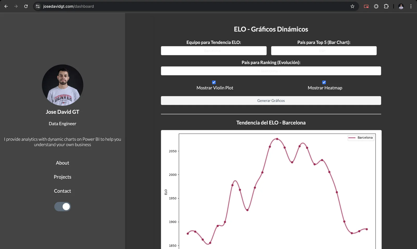
The page has a single form: pick teams to follow, a country for a top-N bar chart,
a country for a ranking-evolution chart, and toggles for a violin plot and a heatmap.
Every change posts the selection to /update_charts, which filters the
DataFrame server-side and returns the five charts as base64 images.
- Team trend — ELO over time for the selected clubs.
- Top N by country — average ELO of the strongest clubs in a league.
- Ranking evolution — how the top clubs of a country swap positions year by year.
- Violin plot — the distribution of ratings across all clubs.
- Heatmap — club × year matrix of average ELO.
Why the charts are rendered elsewhere
Plotting libraries are heavy and slow to import, which hurts on serverless hosting where every cold start counts. So the Flask app only does the pandas filtering and sends the already-reduced records to a small plotting microservice on Google Cloud Run, one endpoint per chart type. The microservice renders the figure and returns it as base64; the web app never imports a plotting library at all.
# app/python/microservice_helpers.py
def get_plot_top_teams_country(df, country, num_teams=5):
    df_country = df[df['country'] == country]
    top_clubs = (df_country.groupby('club')['elo'].mean()
                 .sort_values(ascending=False).head(num_teams).index)
    payload = {"country": country,
               "df": df_country[df_country['club'].isin(top_clubs)].to_dict(orient="records")}
    response = requests.post(f"{MICROSERVICE_URL}/plot_top_teams_country", json=payload)
    response.raise_for_status()
    return response.json()["image_base64"]
Filtering before sending matters: the full dataset is ~9 MB, but a top-5-clubs payload is a few hundred rows. It keeps the request small and the microservice stateless.
Letting the model read the chart
Each chart has an AI conclusions button. It sends the chart type and the
active filters to /generate_conclusions_ajax; the server rebuilds the
same slice of data the chart used, summarizes it (top rows, ranges, aggregates) and
asks GPT-4o for three or four short observations "as a football
analyst". The prompt receives numbers, never the image, which keeps it cheap and
makes the answer verifiable against the chart.
Takeaways
Splitting rendering into a microservice was the right call for a Flask app on serverless hosting, and the "summarize, then ask" pattern for AI explanations is one I have reused since: give the model the data behind the chart, not a picture of it.